 Artemis Fowl Confidential The Ultimate Artemis Fowl Fan Site


It has been a number of years since the Artemis Fowl books had a refresh in the UK. Last year, the US received completely new editions of all the Artemis Fowl books, and this year… it’s the UK’s turn!
The newly covered versions of ARTEMIS FOWL and ARTEMIS FOWL: THE ARCTIC INCIDENT are now available on on Amazon
We’ve currently got the new covers for Books 1 -6, with the new covers for books 7 and 8 coming in April. (EDIT: Books 7 and 8 have now been added!)
Here’s our Twitter reveal video!
Check out the new UK covers for the #ArtemisFowl series!
See the full covers here: https://t.co/ytXAhkY9jg. Books 1 and 2 now available on Amazon (https://t.co/NupZyogp5A) and in all good bookshops!@EoinColfer @ArtemisFowl @PenguinUKBooks @PuffinBooks @PenguinRHUK pic.twitter.com/zap7OLOKEs
— Artemis Fowl (@AFConfidential) March 23, 2019
Without further ado, here are the first 6 new UK covers!

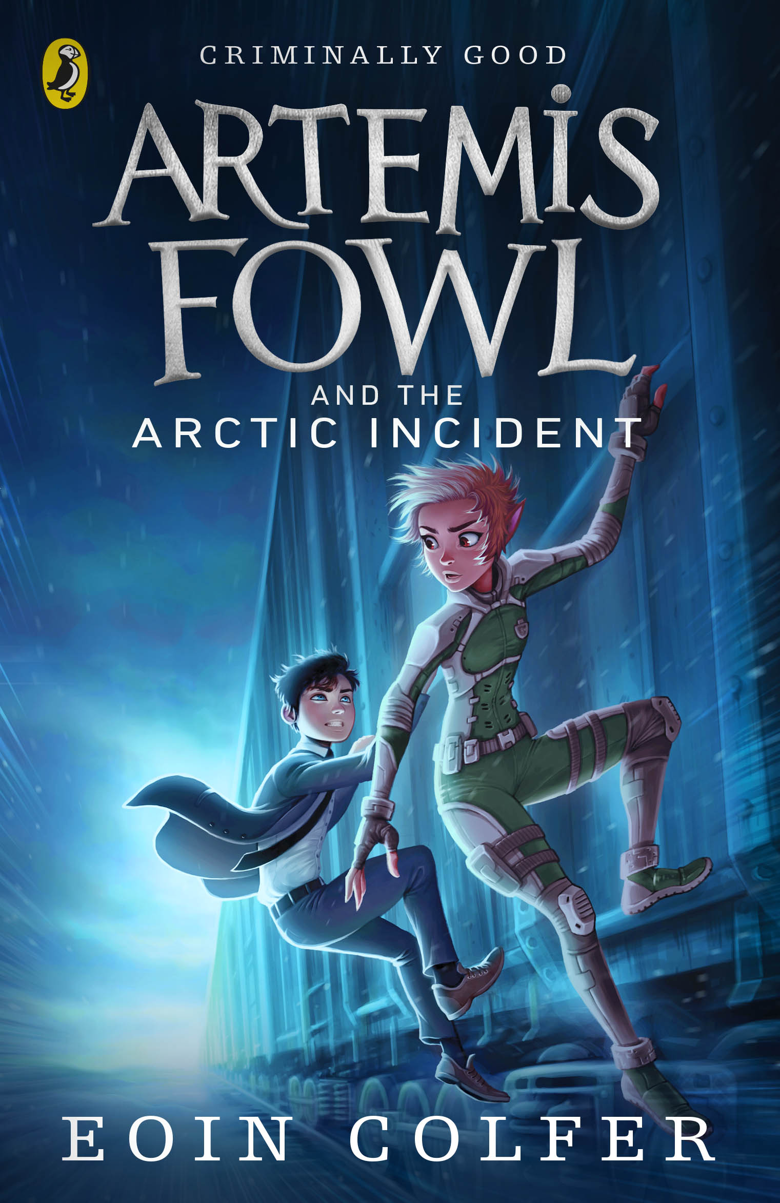




These look awesome! So much cooler than the US ones!
I love the incorporation of Artemis’ eye colors for the Time Paradox. I really love them all. If I had to critique anything, the only thing I’d have to say is that Opal’s (I assume that’s her?) wild her doesn’t really suit her on the cover of The Opal Deception. Other than that, fantastic all around. Definitely convey the key parts of each story without spoiling.
Wow…the colors are beautiful. This is definitely going to draw more kid’s eyes and get them to pick it up and be introduced to this wonderful world. Love it!
can they use this art style for the comics? I absolutely love it. are they only selling this version in the UK, or will they be selling it in the US too? Again, I love the cover art. It looks AMAZING!!
I rly agree! I was hoping the graphic novel and the movie would be like this! Disney has already ruined the movie.
Ahh! Finally some really great covers for the UK editions! I absolutely love the art style—agreed, they should use this style in the comics! Butler on the cover of TEC is already giving me major feels: the fact he’s clutching his chest is a really fantastic touch, and it kind of looks like he’s falling. Also it’s interesting they’ve stuck with the original Gnommish letters rather than using the new movie style Gnommish. Is that a copyright issue or something?
If I didn’t already had them all, I’d rebuy them just for the cover >o<
YOOOOO THESE LOOK AMAZING AND I’M 22 NOW. Darn it. Gonna buy them!
I like these new designs better than the latest US ones. No1 looks so much better in these than the US version where he’s depicted as some weird horned dog creature. Not a huge fan of Opal’s design here though. And I’ve got one big pet peeve about TLG’s cover that I hope is an error they get around to correcting: Holly’s left eye and Artemis’s left eye are both Hazel. Since they swapped, if his left eye is hazel her’s should be blue.
I just wished the graphic novel or the movie would be like these covers. I just love them! Fit so well with how I imagined!!